The Dashboard
Home is the summary screen. It has two views, chosen with the tabs on the right of the toolbar.
- Month to Month — one month at a time, chosen with the stepper on the left.
- Year to Year — a longer stretch, chosen with the range picker.
The toolbar swaps its control to match: the month stepper belongs to the first tab, the range picker to the second.
Month to Month
The month stepper
The arrows walk one month at a time. You cannot step past the current month — the forward arrow is disabled there, because the app has nothing to show for a month that has not happened.
Clicking the month name opens a picker of the last twelve months. The arrows go back further than the picker does, so use the arrows for older history.
All three cards on this tab follow the stepper.
Monthly Cash Flow
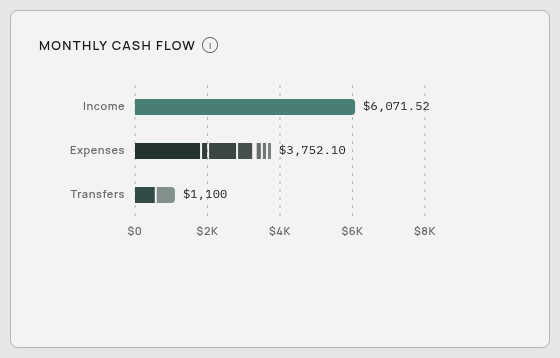
Three horizontal bars for the chosen month: total income, total expenses, and total transfers. Each bar is split into segments, one per category, so you can see what made it up.
Transfers get their own bar because they are neither income nor spending — they are money you moved between your own accounts. See Money In Money Out and Transfers.
Capital Snapshot
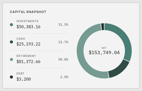
A ring showing what you are worth at the chosen month, split into Cash, Investments, Retirement, and Debt. The number in the middle is your assets minus your debt.
This card reads your Balance Sheet, not your transactions. It shows each account’s most recent value at or before the chosen month — so an account you last updated in March still counts in July, at its March figure. It does not vanish just because you have not touched it.
Debt is drawn at its full size rather than as a negative, so it is actually visible in the ring. It is shaded differently and labelled in the legend so it does not read as an asset.
If this card is empty, your Balance Sheet has no figures yet. See The Statements Page and Balances From Your Statement.
Spending
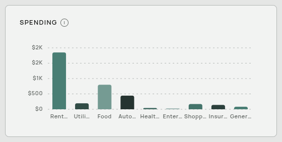
A bar per expense category for the chosen month, largest first. Only categories with actual spending in that month appear.
Year to Year
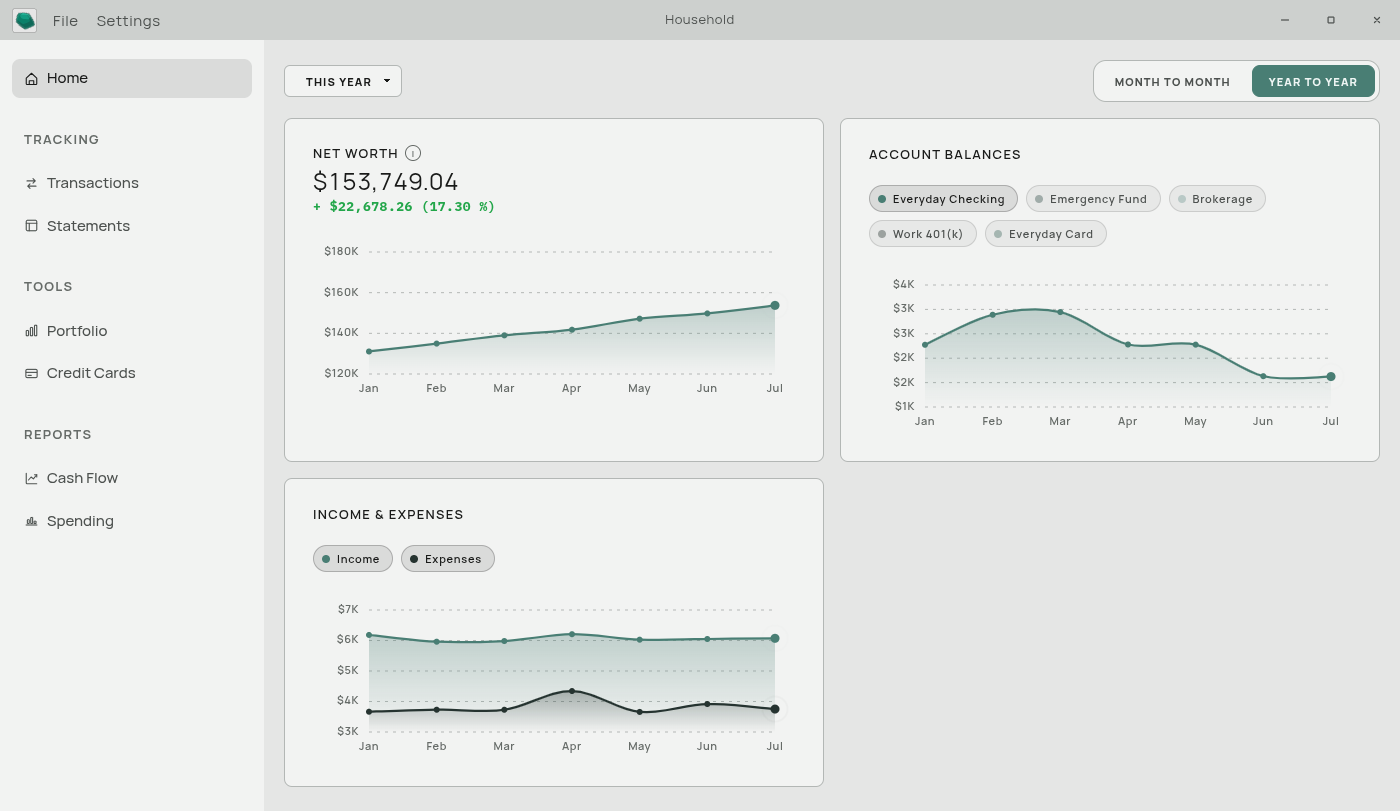
The range picker
This Year (January to the current month), Last 12 Months, Last 24 Months, or Last 5 Years. One choice scopes all three cards on this tab.
Net Worth
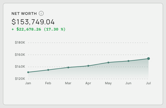
A line of your net worth over the chosen range, with the current figure and the change across the range above it — the money amount followed by the percentage, for example + $30,000 (5.00 %).
Two details worth knowing:
- The big number is your most recent figure overall, not the last point in the range. Changing the range changes the line and the change figure, not the headline.
- Each account carries forward. Every account contributes its latest recorded balance even if that was months ago. A month where you only updated your checking account does not zero out your other accounts.
This card comes entirely from the Balance Sheet. If you never fill it in, this card stays empty.
Account Balances
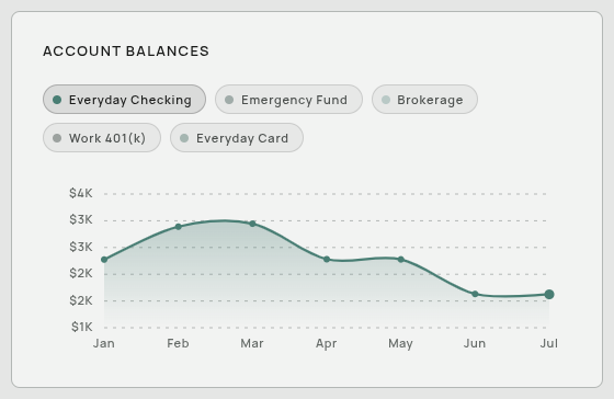
The same Balance Sheet data, but one line per account instead of a single total. Use the buttons above the chart to show and hide individual accounts.
Income & Expenses
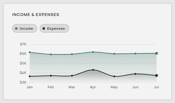
Two lines — money in and money out per month — over the chosen range. This one comes from your Cash Flow statement, so it reflects your transactions.
Where the dashboard’s numbers come from
This trips people up, so it is worth stating plainly.
| Card | Reads from |
|---|---|
| Monthly Cash Flow | Cash Flow statement |
| Spending | Cash Flow statement |
| Income & Expenses | Cash Flow statement |
| Capital Snapshot | Balance Sheet |
| Net Worth | Balance Sheet |
| Account Balances | Balance Sheet |
The Cash Flow statement fills itself in from your transactions, so importing is enough to light up the first three cards. The Balance Sheet does not compute itself from transactions — it holds account balances, which either come from a balance column in an imported file or from you typing them in. That is why a new user often sees three full charts and three empty ones.
There is one further consequence. The dashboard reads the statement, and the statement is organized by year. A year with no statement table contributes nothing to the dashboard, even if transactions exist for it. Imports create the years they need automatically, so this only comes up if you deleted a year by hand. See Statement Years.
The first-run card
On a database that holds nothing you put there, the dashboard is replaced by a single card inviting you to import. See Your First Five Minutes.
It disappears permanently the moment anything real lands in the database, and it can also be dismissed with Skip for now. It cannot appear once you have data, so it will never interrupt you mid-use.
After importing, the dashboard may look empty
The dashboard opens on the current month. If you just imported last year’s history, the current month genuinely has nothing in it. Step the month picker back to a month you actually imported.
Related: Computed and Typed Values · The Statements Page · Cash Flow Reports