Getting Around the App
Every screen in Aventurine sits inside the same frame. This page describes that frame and the small conventions used across the whole app, so the individual page tours can stay focused on their own content.
The title bar

Along the top of the window:
File menu
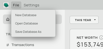
| Item | What it does |
|---|---|
| New Database | Creates a fresh, empty database and switches to it. |
| Open Database | Opens an existing Aventurine database file. |
| Save Database As | Saves a copy of the current database somewhere else and continues working in the copy. |
All three are covered in Databases and Passwords.
Settings menu
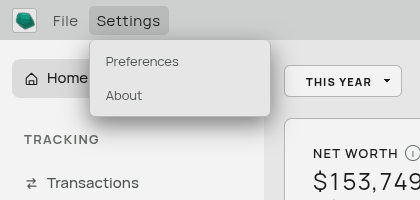
| Item | What it does |
|---|---|
| Preferences | Appearance, transaction handling, number and date formats, security. See Preferences. |
| About | The version of Aventurine you have installed. |
Centre — the name of the database you currently have open. Useful when you keep more than one (household and business, for example).
Right — the usual minimize, maximize, and close buttons.
The sidebar
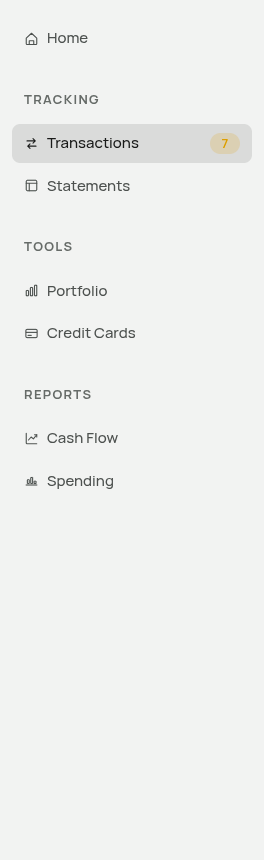
The sidebar is grouped into three sections.
Tracking — where you put data in.
- Transactions — your ledger. See The Transactions Page.
- Statements — Cash Flow and Balance Sheet. See The Statements Page.
Tools — planners that stand slightly apart from the ledger.
- Portfolio — a manual investment tracker. See The Portfolio Page.
- Credit Cards — a card comparison planner. See The Credit Cards Page.
Reports — where you look at what the data says.
- Cash Flow — the money-flow diagram and the forecast. See Cash Flow Reports.
- Spending — spending by category over time. See The Spending Page.
Home sits above all of them and is the dashboard. See The Dashboard.
The number badge
A small pill next to Transactions shows how many transactions still have no category. It appears on every page, and updates as you work. When it is gone, everything in your ledger is categorized.
It caps at “99+” so it never grows wide enough to disturb the layout.
Signals used across the app
These conventions are consistent everywhere, so learning them once covers the whole app.
Colour carries direction. Green means money coming in, red means money going out, and blue means a transfer between your own accounts. This applies to amounts, to category pills, and to chart bars. Amber means “needs your attention” — an uncategorized transaction, for example.
Accent-coloured italics mean “the app worked this out” in the Cash Flow statement. Plain text means you typed it. This is explained properly in Computed and Typed Values.
The ⋮ button holds the rare actions. Where a page has actions you use occasionally — add a year, manage columns, delete something — they live behind a three-dot menu rather than cluttering the toolbar.
The small “i” circle is a tooltip. Hover it (or focus it with the keyboard) for an explanation of the card or number it sits next to. Several are worth reading — the Net Worth and Forecast ones in particular explain exactly how those numbers are put together.
Grey shapes mean “loading”. When a page is fetching data, it shows grey placeholder shapes the same size as the real content, so nothing jumps around when the data arrives. They only appear if loading takes long enough to notice.
Toasts appear briefly in the corner to confirm something or report a problem. The important one to know: “Couldn’t save your change — it hasn’t been stored.” If you see that, the value you typed did not make it into your database. It is the app’s way of never letting a failed save look like a successful one.
Empty states
Instead of blank space, an area with no data explains what would go there and offers a button to fix it — “Import transactions”, “Add transactions”, “Add balances”. These are the fastest route to whatever is missing.
Moving around with the keyboard
Tab moves between controls. Inside the tables, arrow keys move cell to cell like a spreadsheet. Escape closes dialogs and menus. See Keyboard Shortcuts for the complete list.
Related: The Dashboard · Preferences