Cash Flow Reports
The Cash Flow item in the sidebar’s Reports section holds two reports behind tabs.
The Cash Flow diagram
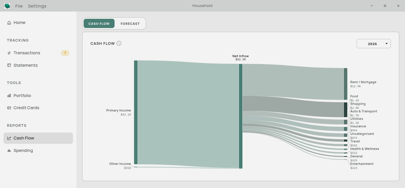
A single picture of where a year’s money went.
Income categories sit on the left. They flow into one central node — Net Inflow — which then fans out to your expense categories on the right. The width of each band is that category’s total for the year, so the biggest bands are the biggest numbers.
Controls. One year picker, top right.
Hovering any band or node shows its exact amount.
Clicking a category takes you to the Transactions page with that year and that category already filtered — the fastest way to answer “what is all that?”.
Uncategorized money appears as its own band. If it is one of the widest bands on the page, that is the diagram telling you where to spend ten minutes.
If the selected year has nothing in it, the card shows an empty state instead of a diagram.
The Forecast
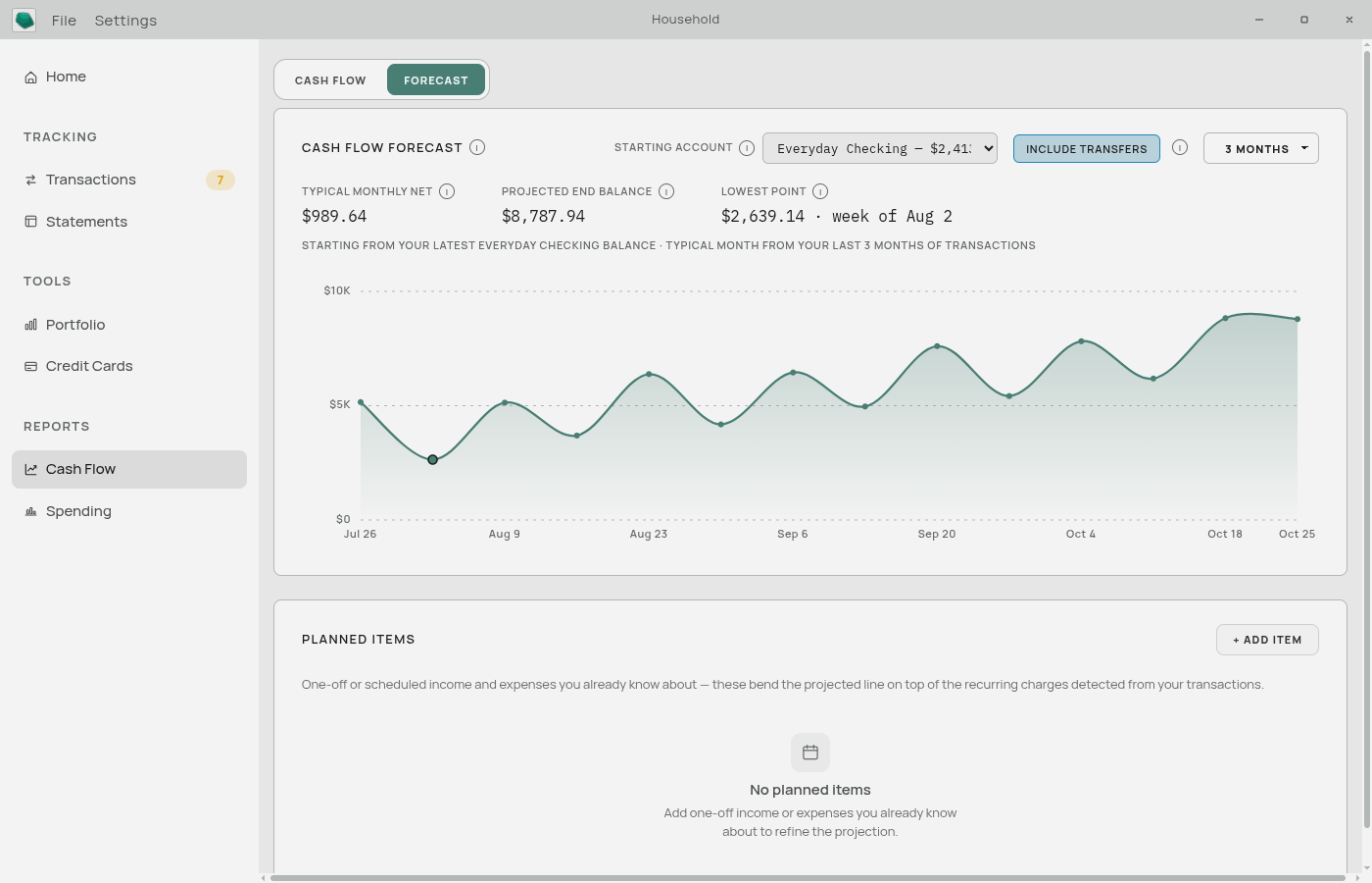
A projection of one cash account’s balance, week by week, up to six months ahead.
Weekly resolution is the point of it: a monthly projection tells you that the month works out, while a weekly one shows you the Tuesday before payday when it does not.
Controls
Starting account — which cash account to project from. Only Cash-type accounts on your Balance Sheet are offered, since the forecast tracks spendable money. The projection starts from that account’s most recent Balance Sheet figure.
Include transfers — on by default.
- On: money you move to savings or a brokerage counts as leaving this account. The line shows what you can actually spend.
- Off: transfers are ignored, showing the balance as if that money had stayed put.
Range — 1, 3, or 6 months.
What the summary tells you

Above the chart:
- Projected end balance — where the line finishes.
- Lowest point — the smallest balance in the whole projection, and the week it falls in. This is usually the number worth reading. Either figure turns red when it goes negative.
Hovering any point on the line shows that week’s balance and net change.
How the projection is built
Each week’s change is the sum of three things.
1. Your typical irregular spending, spread evenly. Aventurine averages your monthly income and spending over recent complete months, removes anything it recognizes as a recurring pattern, and spreads what is left evenly across the weeks. This keeps the overall slope honest — groceries, fuel, and one-off purchases are real even though they do not land on a schedule.
2. Recurring bills and paychecks, on their actual dates. The app looks through your history for things that repeat — same merchant, regular gap. Something needs to have happened at least three times, with reasonably consistent timing, before it counts. Recognized patterns are projected forward and dropped into the specific week they are due, which is what gives the line its shape within a month. They are removed from the smooth average above so nothing is counted twice.
3. Planned items you entered. Dropped into the week of their date.
Planned Items
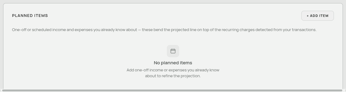
Below the chart. Things you already know about that your history cannot predict: a tax bill, a bonus, a holiday.
+ Add item takes a label, an amount, whether it is money in or money out, and a date. Each one bends the projected line in its week. They can be edited and deleted from the same list.
When the forecast is not useful
- With no Balance Sheet figures, it starts from zero. The shape is still right; the height is meaningless. Fill in one balance for the account and it becomes real.
- With less than a few months of history, the average has little to work from and no recurring patterns have been recognized yet.
- If your history stops months ago, the projection starts from stale assumptions. Import recent transactions first.
Everything here is calculated on your computer, from your own data.
Related: The Statements Page · Accounts · Money In Money Out and Transfers